Mendoza Contractors, abbreviated MZA Contractors, came during a pivotal transition: a father-to-son leadership shift and an expansion of services beyond strictly commercial work. With this change, the company needed an identity that balanced legacy with a modern vision. The rebrand reflects their growth while maintaining the trust and professionalism they’ve built over decades.
The existing identity felt dated and tied too narrowly to commercial construction. The client wanted a fresh look that would mark the generational transition in leadership, reflect a broader scope of services, and signal professionalism, growth, and adaptability.


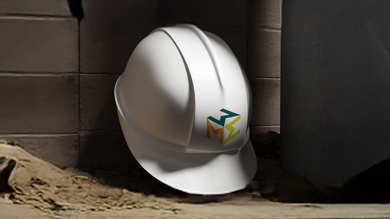
The rebrand centered on an evolving presence with a modern identity system built for flexibility and recognition. The new logo introduces clean, geometric letterforms that convey strength and stability, while updated typography and a bolder palette bring clarity and impact across every application. From stationery and signage to fleet graphics and digital platforms, the refreshed design system creates consistency and ensures the company presents itself with confidence and momentum as it enters its next chapter.


The new MZA Contractors identity positions the company for long-term recognition and growth. It bridges past and future, reinforcing credibility while giving the next generation of leadership a strong foundation to build on.

Whether you’re here to talk roles, creative challenges, or something in between, I’m all ears. I love thoughtful work, collaborative teams, and solving problems.